
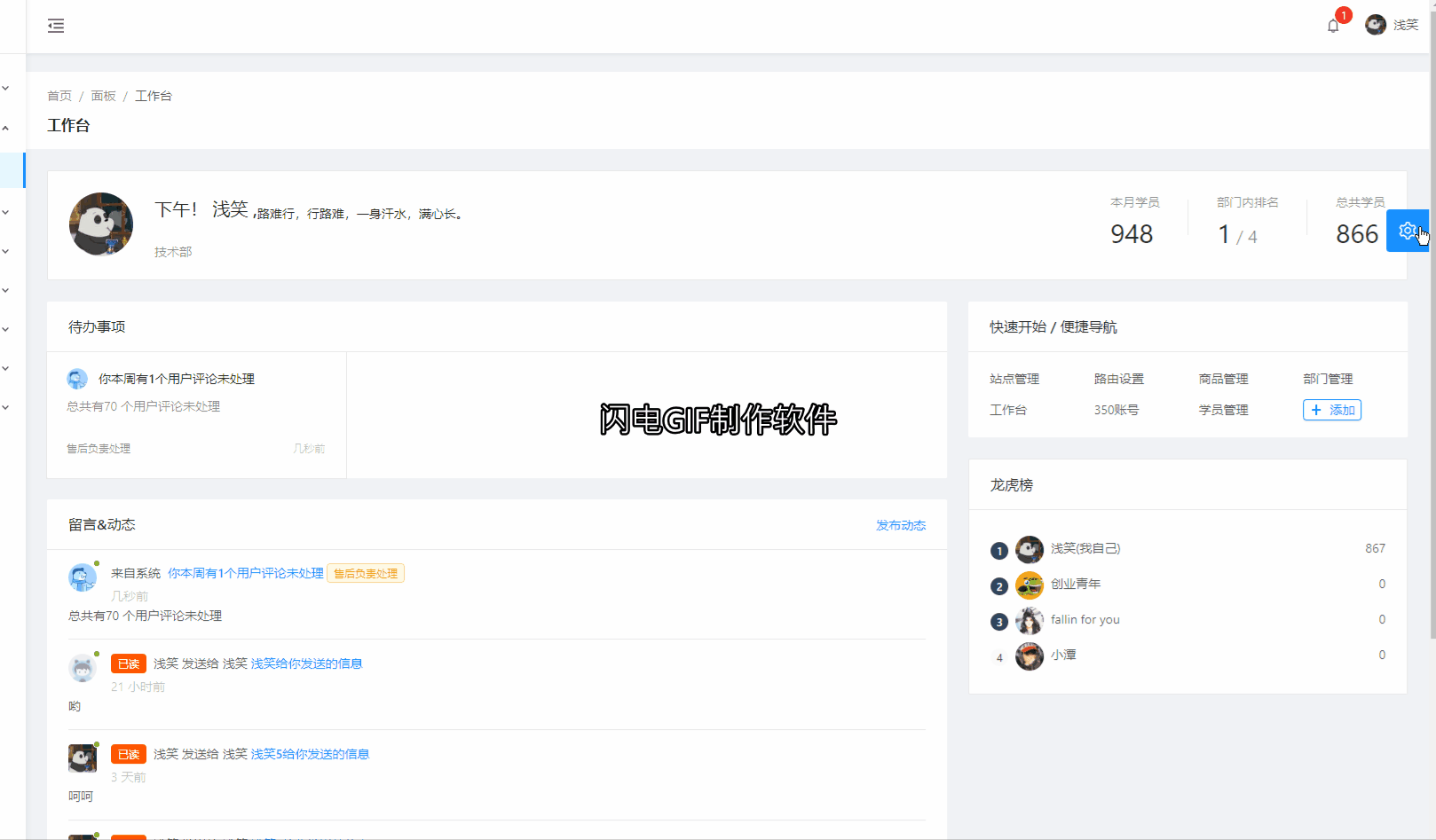
最终效果图:
ant-design-pro 版本:
  "name": "ant-design-pro",
  "version": "1.0.0",
  "private": true,
antd 和 pro-layout 版本
  "@ant-design/pro-layout": "^4.5.9",
  "antd": "^3.20.0",
需要用到的扩展:webpack-theme-color-replacer 版本:(注:这个是ant-design-pro下载时自带的,如果没有自己可以下载一份)
"webpack-theme-color-replacer": "^1.2.15"
第一步:
修改 /src/layouts/BasicLayout.jsx
const BasicLayout = props => {
      return(
           <ProLayoutComponents
            //详情请参考ant-layout文档
            {...}>
             //加入以下主题配置修改的抽屉
             <SettingDrawer settings={settings} onSettingChange={(e)=>{
               // console.log('rightProps',e);
               dispatch({
                    type: 'settings/changeSetting',
                    payload:e
                  });
                 }}></SettingDrawer>
             </ProLayoutComponents>
       )
}
第二步:
修改:/src/models/setting.js
这是修改后的两个方法:
    getSetting(state = defaultSettings) {
      // 不从url param里面获取配置值
      // const setting = {};
      // const urlParams = new URL(window.location.href);
      // Object.keys(state).forEach(key => {
      //   if (urlParams.searchParams.has(key)) {
      //     const value = urlParams.searchParams.get(key);
      //     setting[key] = value === '1' ? true : value;
      //   }
      // });
      //这里从 localStorage 里面获取 配置 默认值 为 空 {}
      let setting = localStorage.getItem('ThemeSetting') || '{}';
      //因为 取出来之后是 字符串类型 需要转换为 object
      setting = JSON.parse(setting)
      const { primaryColor, colorWeak } = setting;
      // 判断是否存在 主题颜色。如果有的话 就去自动设置
      if (primaryColor && state.primaryColor !== primaryColor) {
        updateTheme(primaryColor);
      }

      updateColorWeak(!!colorWeak);
      return { ...state, ...setting };
    },

    changeSetting(state = defaultSettings, { payload }) {
      // 去除url param 拼接
      // const urlParams = new URL(window.location.href);
      // Object.keys(defaultSettings).forEach(key => {
      //   if (urlParams.searchParams.has(key)) {
      //     urlParams.searchParams.delete(key);
      //   }
      // });
      // Object.keys(payload).forEach(key => {
      //   if (key === 'collapse') {
      //     return;
      //   }

      //   let value = payload[key];

      //   if (value === true) {
      //     value = 1;
      //   }

      //   if (defaultSettings[key] !== value) {
      //     urlParams.searchParams.set(key, value);
      //   }
      // });
      const { primaryColor, colorWeak, contentWidth } = payload;

      if (primaryColor && state.primaryColor !== primaryColor) {
        updateTheme(primaryColor);
      }

      if (state.contentWidth !== contentWidth && window.dispatchEvent) {
        window.dispatchEvent(new Event('resize'));
      }
      updateColorWeak(!!colorWeak);
      // 写入配置到本地存储
      // 需要把 object 转换为 string 再存储
      localStorage.setItem('ThemeSetting',JSON.stringify(payload))
      // 去除url param 拼接
      // window.history.replaceState(null, 'setting', urlParams.href);
      return { ...state, ...payload };
    },
第三步:
修改:/node_modules/webpack-theme-color-replacer/client/themeColorChanger.js
修改后的代码如下:
var idMap = {};
var theme_COLOR_config;

module.exports = {
    changeColor: function (options, promiseForIE) {
        var win = window // || global
        if (!theme_COLOR_config) {
            theme_COLOR_config = win.__theme_COLOR_cfg || {}
        }
        var oldColors = options.oldColors || theme_COLOR_config.colors || []
        var newColors = options.newColors || []
        var cssUrl = theme_COLOR_config.url || options.cssUrl;
        if (options.changeUrl) {
            cssUrl = options.changeUrl(cssUrl)
        }
        var _this = this;
        var Promise = promiseForIE || win.Promise
        return new Promise(function (resolve, reject) {
            if (isSameArr(oldColors, newColors)) {
                resolve()
            }
            else {
                getCssText(cssUrl, setCssTo, resolve, reject)
            }
        })

        function getCssText(url, setCssTo, resolve, reject) {
            var elStyle = idMap[url] && document.getElementById(idMap[url]);
            if (elStyle) {
                oldColors = elStyle.color.split('|')
                setCssTo(elStyle, elStyle.innerText)
                resolve()
            } else {

                elStyle = document.head.appendChild(document.createElement('style'))
                idMap[url] = 'css_' + (+new Date())
                elStyle.setAttribute('id', idMap[url])
                //这里修改 吧以前的 url 参数取缔。这里暂时不用ajax 请求 css代码
                _this.getCSSString(function (cssText) {
                    setCssTo(elStyle, cssText)
                    resolve()
                }, reject)
            }
        }

        function setCssTo(elStyle, cssText) {
            cssText = _this.replaceCssText(cssText, oldColors, newColors)
            elStyle.color = newColors.join('|')
            elStyle.innerText = cssText
            theme_COLOR_config.colors = newColors
        }
    },
    replaceCssText: function (cssText, oldColors, newColors) {
        //这里加一个判断 是因为 如果 第一次打开是默认主题 oldColors 是空数组 而导致不能走下方的遍历 所以给一个默认主题的颜色数组
        if(oldColors.length === 0) {
            oldColors = ["#1890ff", "#2f9bff", "#46a6ff", "#5db1ff", "#74bcff", "#8cc8ff", "#a3d3ff", "#badeff", "#d1e9ff", "#e6f7ff", "#bae7ff", "#91d5ff", "#69c0ff", "#40a9ff", "#1890ff", "#096dd9", "#0050b3", "#003a8c", "#002766"]
        }
        oldColors.forEach(function (color, t) {
            cssText = cssText.replace(new RegExp(color.replace(/,/g, ',\s*'), 'ig'), newColors[t]) // 255, 255,3
        })
        return cssText
    },
    /**
     *
     * @param {这里原先是通过 ajax 请求编译less 的css代码,这里我改成了返回固定的字符串} resolve
     */
    getCSSString: function ( resolve) {
        //这里面的代码是 在开发环境 里面复制的。可以自己去开发环境复制一份
        resolve(`
        .ant-result-info .ant-result-icon > .anticon{ color: #1890ff}
.ant-tree.ant-tree-directory .ant-tree-child-tree > li span.ant-tree-node-content-wrapper:hover::before,.ant-tree.ant-tree-directory > li span.ant-tree-node-content-wrapper:hover::before{ background: #e6f7ff}
.ant-tree.ant-tree-directory .ant-tree-child-tree > li.ant-tree-treenode-selected > span.ant-tree-checkbox .ant-tree-checkbox-inner,.ant-tree.ant-tree-directory > li.ant-tree-treenode-selected > span.ant-tree-checkbox .ant-tree-checkbox-inner{ border-color: #1890FF}
.ant-tree.ant-tree-directory .ant-tree-child-tree > li.ant-tree-treenode-selected > span.ant-tree-checkbox.ant-tree-checkbox-checked .ant-tree-checkbox-inner::after,.ant-tree.ant-tree-directory > li.ant-tree-treenode-selected > span.ant-tree-checkbox.ant-tree-checkbox-checked .ant-tree-checkbox-inner::after{ border-color: #1890FF}
.ant-tree.ant-tree-directory .ant-tree-child-tree > li.ant-tree-treenode-selected > span.ant-tree-node-content-wrapper::before,.ant-tree.ant-tree-directory > li.ant-tree-treenode-selected > span.ant-tree-node-content-wrapper::before{ background: #1890FF}
.ant-tree-checkbox-input:focus + .ant-tree-checkbox-inner,.ant-tree-checkbox-wrapper:hover .ant-tree-checkbox-inner,.ant-tree-checkbox:hover .ant-tree-checkbox-inner{ border-color: #1890FF}
.ant-tree-checkbox-checked::after{ border: 1px solid #1890FF}
.ant-tree-checkbox-checked .ant-tree-checkbox-inner{ background-color: #1890FF; border-color: #1890FF}
.ant-tree-checkbox-indeterminate .ant-tree-checkbox-inner::after{ background-color: #1890FF}
.ant-tree li.drag-over > span[draggable]{ background-color: #1890FF}
.ant-tree li.drag-over-gap-top > span[draggable]{ border-top-color: #1890FF}
.ant-tree li.drag-over-gap-bottom > span[draggable]{ border-bottom-color: #1890FF}
.ant-tree li.ant-tree-treenode-loading span.ant-tree-switcher.ant-tree-switcher_close .ant-tree-switcher-loading-icon,.ant-tree li.ant-tree-treenode-loading span.ant-tree-switcher.ant-tree-switcher_open .ant-tree-switcher-loading-icon{ color: #1890FF}
.ant-tree li .ant-tree-node-content-wrapper:hover{ background-color: #e6f7ff}
.ant-tree li .ant-tree-node-content-wrapper.ant-tree-node-selected{ background-color: #bae7ff}
.ant-steps-item-icon > .ant-steps-icon{ color: #1890FF}
.ant-steps-item-process .ant-steps-item-icon{ border-color: #1890FF}
.ant-steps-item-process .ant-steps-item-icon > .ant-steps-icon{ color: #1890FF}
.ant-steps-item-process .ant-steps-item-icon > .ant-steps-icon .ant-steps-icon-dot{ background: #1890FF}
.ant-steps-item-process .ant-steps-item-icon{ background: #1890FF}
.ant-steps-item-finish .ant-steps-item-icon{ border-color: #1890FF}
.ant-steps-item-finish .ant-steps-item-icon > .ant-steps-icon{ color: #1890FF}
.ant-steps-item-finish .ant-steps-item-icon > .ant-steps-icon .ant-steps-icon-dot{ background: #1890FF}
.ant-steps-item-finish > .ant-steps-item-content > .ant-steps-item-title::after{ background-color: #1890FF}
.ant-steps-item-finish > .ant-steps-item-tail::after{ background-color: #1890FF}
.ant-steps-item[role='button']:not(.ant-steps-item-process):hover .ant-steps-item-description,.ant-steps-item[role='button']:not(.ant-steps-item-process):hover .ant-steps-item-title{ color: #1890FF}
.ant-steps-item[role='button']:not(.ant-steps-item-process):hover .ant-steps-item-icon{ border-color: #1890FF}
.ant-steps-item[role='button']:not(.ant-steps-item-process):hover .ant-steps-item-icon .ant-steps-icon{ color: #1890FF}
.ant-steps-item-custom.ant-steps-item-process .ant-steps-item-icon > .ant-steps-icon{ color: #1890FF}
.antd-pro-pages-dashboard-workplace-index-members a:hover{ color: #1890FF}
.antd-pro-pages-dashboard-workplace-index-projectList .antd-pro-pages-dashboard-workplace-index-cardTitle a:hover{ color: #1890FF}
.antd-pro-pages-dashboard-workplace-index-projectList .antd-pro-pages-dashboard-workplace-index-projectItemContent a:hover{ color: #1890FF}
.antd-pro-pages-dashboard-workplace-index-linkGroup > a:hover{ color: #1890FF}
.ant-input-number:hover{ border-color: #40a9ff}
.ant-input-number:focus{ border-color: #40a9ff}
.ant-input-number-handler:hover .ant-input-number-handler-down-inner,.ant-input-number-handler:hover .ant-input-number-handler-up-inner{ color: #40a9ff}
.ant-input-number-focused{ border-color: #40a9ff}
a{ color: #1890FF}
a:hover{ color: #40a9ff}
a:active{ color: #096dd9}
::selection{ background: #1890FF}
html{ --antd-wave-shadow-color: #1890FF}
.ant-click-animating-node,[ant-click-animating-without-extra-node='true']::after{ box-shadow: 0 0 0 0 #1890FF}
@keyframes waveEffect{100%{ box-shadow: 0 0 0 #1890FF}}
.ant-btn:focus:not(.ant-btn-primary),.ant-btn:hover:not(.ant-btn-primary){ color: #40a9ff; border-color: #40a9ff}
.ant-btn.active:not(.ant-btn-primary),.ant-btn:active:not(.ant-btn-primary){ color: #096dd9; border-color: #096dd9}
.ant-btn-primary{ background-color: #1890FF; border-color: #1890FF}
.ant-btn-primary:focus,.ant-btn-primary:hover{ background-color: #40a9ff; border-color: #40a9ff}
.ant-btn-primary.active,.ant-btn-primary:active{ background-color: #096dd9; border-color: #096dd9}
.ant-btn-group .ant-btn-primary:not(:first-child):not(:last-child){ border-right-color: #40a9ff; border-left-color: #40a9ff}
.ant-btn-group .ant-btn-primary:first-child:not(:last-child){ border-right-color: #40a9ff}
.ant-btn-group .ant-btn-primary + .ant-btn-primary,.ant-btn-group .ant-btn-primary:last-child:not(:first-child){ border-left-color: #40a9ff}
.ant-btn-ghost:focus,.ant-btn-ghost:hover{ color: #40a9ff; border-color: #40a9ff}
.ant-btn-ghost.active,.ant-btn-ghost:active{ color: #096dd9; border-color: #096dd9}
.ant-btn-dashed:focus,.ant-btn-dashed:hover{ color: #40a9ff; border-color: #40a9ff}
.ant-btn-dashed.active,.ant-btn-dashed:active{ color: #096dd9; border-color: #096dd9}
.ant-btn-link{ color: #1890FF}
.ant-btn-link:focus,.ant-btn-link:hover{ color: #40a9ff; border-color: #40a9ff}
.ant-btn-link.active,.ant-btn-link:active{ color: #096dd9; border-color: #096dd9}
.ant-btn-background-ghost.ant-btn-primary{ color: #1890FF; border-color: #1890FF}
.ant-btn-background-ghost.ant-btn-primary:focus,.ant-btn-background-ghost.ant-btn-primary:hover{ color: #40a9ff; border-color: #40a9ff}
.ant-btn-background-ghost.ant-btn-primary.active,.ant-btn-background-ghost.ant-btn-primary:active{ color: #096dd9; border-color: #096dd9}
.ant-btn-background-ghost.ant-btn-link{ color: #1890FF}
.ant-btn-background-ghost.ant-btn-link:focus,.ant-btn-background-ghost.ant-btn-link:hover{ color: #40a9ff}
.ant-btn-background-ghost.ant-btn-link.active,.ant-btn-background-ghost.ant-btn-link:active{ color: #096dd9}
.anticon.ant-notification-notice-icon-info{ color: #1890ff}
.ant-message-info .anticon,.ant-message-loading .anticon{ color: #1890ff}
.ant-spin{ color: #1890FF}
.ant-spin-dot-item{ background-color: #1890FF}
.ant-pro-global-header .dark .action.opened,.ant-pro-global-header .dark .action:hover{ background: #1890FF}
.ant-pro-sider-menu-sider.light .ant-pro-sider-menu-logo h1{ color: #1890FF}
.ant-menu-submenu-selected{ color: #1890FF}
.ant-menu-item:active,.ant-menu-submenu-title:active{ background: #e6f7ff}
.ant-menu-item > a:hover{ color: #1890FF}
.ant-menu-item-active,.ant-menu-item:hover,.ant-menu-submenu-active,.ant-menu-submenu-title:hover,.ant-menu:not(.ant-menu-inline) .ant-menu-submenu-open{ color: #1890FF}
.ant-menu-item-selected{ color: #1890FF}
.ant-menu-item-selected > a,.ant-menu-item-selected > a:hover{ color: #1890FF}
.ant-menu:not(.ant-menu-horizontal) .ant-menu-item-selected{ background-color: #e6f7ff}
.ant-menu-submenu-inline > .ant-menu-submenu-title:hover .ant-menu-submenu-arrow::after,.ant-menu-submenu-inline > .ant-menu-submenu-title:hover .ant-menu-submenu-arrow::before,.ant-menu-submenu-vertical > .ant-menu-submenu-title:hover .ant-menu-submenu-arrow::after,.ant-menu-submenu-vertical > .ant-menu-submenu-title:hover .ant-menu-submenu-arrow::before,.ant-menu-submenu-vertical-left > .ant-menu-submenu-title:hover .ant-menu-submenu-arrow::after,.ant-menu-submenu-vertical-left > .ant-menu-submenu-title:hover .ant-menu-submenu-arrow::before,.ant-menu-submenu-vertical-right > .ant-menu-submenu-title:hover .ant-menu-submenu-arrow::after,.ant-menu-submenu-vertical-right > .ant-menu-submenu-title:hover .ant-menu-submenu-arrow::before{ background: linear-gradient(to right, #1890FF, #1890FF)}
.ant-menu-vertical .ant-menu-submenu-selected,.ant-menu-vertical-left .ant-menu-submenu-selected,.ant-menu-vertical-right .ant-menu-submenu-selected{ color: #1890FF}
.ant-menu-vertical .ant-menu-submenu-selected > a,.ant-menu-vertical-left .ant-menu-submenu-selected > a,.ant-menu-vertical-right .ant-menu-submenu-selected > a{ color: #1890FF}
.ant-menu-horizontal > .ant-menu-item-active,.ant-menu-horizontal > .ant-menu-item-open,.ant-menu-horizontal > .ant-menu-item-selected,.ant-menu-horizontal > .ant-menu-item:hover,.ant-menu-horizontal > .ant-menu-submenu-active,.ant-menu-horizontal > .ant-menu-submenu-open,.ant-menu-horizontal > .ant-menu-submenu-selected,.ant-menu-horizontal > .ant-menu-submenu:hover{ color: #1890FF; border-bottom: 2px solid #1890FF}
.ant-menu-horizontal > .ant-menu-item > a:hover{ color: #1890FF}
.ant-menu-horizontal > .ant-menu-item-selected > a{ color: #1890FF}
.ant-menu-inline .ant-menu-item::after,.ant-menu-vertical .ant-menu-item::after,.ant-menu-vertical-left .ant-menu-item::after,.ant-menu-vertical-right .ant-menu-item::after{ border-right: 3px solid #1890FF}
.ant-menu-submenu-popup.ant-menu-dark .ant-menu-item-selected,.ant-menu.ant-menu-dark .ant-menu-item-selected{ background-color: #1890FF}
.ant-list-item-meta-title > a:hover{ color: #1890FF}
.ant-pagination-item:focus,.ant-pagination-item:hover{ border-color: #1890FF}
.ant-pagination-item:focus a,.ant-pagination-item:hover a{ color: #1890FF}
.ant-pagination-item-active{ border-color: #1890FF}
.ant-pagination-item-active a{ color: #1890FF}
.ant-pagination-item-active:focus,.ant-pagination-item-active:hover{ border-color: #40a9ff}
.ant-pagination-item-active:focus a,.ant-pagination-item-active:hover a{ color: #40a9ff}
.ant-pagination-jump-next .ant-pagination-item-container .ant-pagination-item-link-icon,.ant-pagination-jump-prev .ant-pagination-item-container .ant-pagination-item-link-icon{ color: #1890FF}
.ant-pagination-next:hover a,.ant-pagination-prev:hover a{ border-color: #40a9ff}
.ant-pagination-next:focus .ant-pagination-item-link,.ant-pagination-next:hover .ant-pagination-item-link,.ant-pagination-prev:focus .ant-pagination-item-link,.ant-pagination-prev:hover .ant-pagination-item-link{ color: #1890FF; border-color: #1890FF}
.ant-pagination-options-quick-jumper input:hover{ border-color: #40a9ff}
.ant-pagination-options-quick-jumper input:focus{ border-color: #40a9ff}
.ant-pagination-simple .ant-pagination-simple-pager input:hover{ border-color: #1890FF}
.ant-select-selection:hover{ border-color: #40a9ff}
.ant-select-focused .ant-select-selection,.ant-select-selection:active,.ant-select-selection:focus{ border-color: #40a9ff}
.ant-select-open .ant-select-selection{ border-color: #40a9ff}
.ant-select-dropdown-menu-item:hover:not(.ant-select-dropdown-menu-item-disabled){ background-color: #e6f7ff}
.ant-select-dropdown-menu-item-active:not(.ant-select-dropdown-menu-item-disabled){ background-color: #e6f7ff}
.ant-select-dropdown.ant-select-dropdown--multiple .ant-select-dropdown-menu-item-selected .ant-select-selected-icon,.ant-select-dropdown.ant-select-dropdown--multiple .ant-select-dropdown-menu-item-selected:hover .ant-select-selected-icon{ color: #1890FF}
.ant-switch-checked.ant-switch-loading .ant-switch-loading-icon{ color: #1890FF}
.ant-switch-checked{ background-color: #1890FF}
.ant-pro-setting-drawer-block-checbox-selectIcon{ color: #1890FF}
.ant-pro-setting-drawer-handle{ background: #1890FF}
.ant-table-thead > tr > th .ant-table-filter-selected.anticon-filter{ color: #1890FF}
.ant-table-thead > tr > th .ant-table-column-sorter .ant-table-column-sorter-inner .ant-table-column-sorter-down.on,.ant-table-thead > tr > th .ant-table-column-sorter .ant-table-column-sorter-inner .ant-table-column-sorter-up.on{ color: #1890FF}
.ant-table-tbody > tr.ant-table-row-hover:not(.ant-table-expanded-row) > td,.ant-table-tbody > tr:hover:not(.ant-table-expanded-row) > td,.ant-table-thead > tr.ant-table-row-hover:not(.ant-table-expanded-row) > td,.ant-table-thead > tr:hover:not(.ant-table-expanded-row) > td{ background: #e6f7ff}
.ant-table-filter-dropdown .ant-dropdown-menu .ant-dropdown-submenu-contain-selected .ant-dropdown-menu-submenu-title::after{ color: #1890FF; text-shadow: 0 0 2px #bae7ff}
.ant-table-filter-dropdown-link{ color: #1890FF}
.ant-table-filter-dropdown-link:hover{ color: #40a9ff}
.ant-table-filter-dropdown-link:active{ color: #096dd9}
.ant-page-header-back-button{ color: #1890FF}
.ant-page-header-back-button:focus,.ant-page-header-back-button:hover{ color: #40a9ff}
.ant-page-header-back-button:active{ color: #096dd9}
.ant-breadcrumb a:hover{ color: #40a9ff}
.ant-dropdown-menu-item-selected,.ant-dropdown-menu-item-selected > a,.ant-dropdown-menu-submenu-title-selected,.ant-dropdown-menu-submenu-title-selected > a{ color: #1890FF; background-color: #e6f7ff}
.ant-dropdown-menu-item:hover,.ant-dropdown-menu-submenu-title:hover{ background-color: #e6f7ff}
.ant-dropdown-menu-dark .ant-dropdown-menu-item-selected,.ant-dropdown-menu-dark .ant-dropdown-menu-item-selected > a,.ant-dropdown-menu-dark .ant-dropdown-menu-item-selected:hover{ background: #1890FF}
.ant-card-actions > li > span:hover{ color: #1890FF}
.ant-card-actions > li > span a:hover{ color: #1890FF}
.ant-tabs.ant-tabs-card .ant-tabs-card-bar .ant-tabs-tab-active{ color: #1890FF}
.ant-tabs.ant-tabs-card .ant-tabs-card-bar .ant-tabs-tab-disabled{ color: #1890FF}
.ant-tabs-extra-content .ant-tabs-new-tab:hover{ color: #1890FF; border-color: #1890FF}
.ant-tabs .ant-tabs-card-bar.ant-tabs-bottom-bar .ant-tabs-tab-active{ color: #1890FF}
.ant-tabs-ink-bar{ background-color: #1890FF}
.ant-tabs-nav .ant-tabs-tab:hover{ color: #40a9ff}
.ant-tabs-nav .ant-tabs-tab:active{ color: #096dd9}
.ant-tabs-nav .ant-tabs-tab-active{ color: #1890FF}
.ant-tag-checkable:not(.ant-tag-checkable-checked):hover{ color: #1890FF}
.ant-tag-checkable-checked{ background-color: #1890FF}
.ant-tag-checkable:active{ background-color: #096dd9}
.ant-tag-blue{ color: #1890ff; background: #e6f7ff; border-color: #91d5ff}
.ant-tag-blue-inverse{ background: #1890ff; border-color: #1890ff}
.ant-radio-input:focus + .ant-radio-inner,.ant-radio-wrapper:hover .ant-radio,.ant-radio:hover .ant-radio-inner{ border-color: #1890FF}
.ant-radio-checked::after{ border: 1px solid #1890FF}
.ant-radio-inner::after{ background-color: #1890FF}
.ant-radio-checked .ant-radio-inner{ border-color: #1890FF}
.ant-radio-button-wrapper:hover{ color: #1890FF}
.ant-radio-button-wrapper-checked{ color: #1890FF; border-color: #1890FF; box-shadow: -1px 0 0 0 #1890FF}
.ant-radio-button-wrapper-checked::before{ background-color: #1890FF !important}
.ant-radio-button-wrapper-checked:first-child{ border-color: #1890FF}
.ant-radio-button-wrapper-checked:hover{ color: #40a9ff; border-color: #40a9ff; box-shadow: -1px 0 0 0 #40a9ff}
.ant-radio-button-wrapper-checked:active{ color: #096dd9; border-color: #096dd9; box-shadow: -1px 0 0 0 #096dd9}
.ant-radio-group-solid .ant-radio-button-wrapper-checked:not(.ant-radio-button-wrapper-disabled){ background: #1890FF; border-color: #1890FF}
.ant-radio-group-solid .ant-radio-button-wrapper-checked:not(.ant-radio-button-wrapper-disabled):hover{ background: #40a9ff; border-color: #40a9ff}
.ant-radio-group-solid .ant-radio-button-wrapper-checked:not(.ant-radio-button-wrapper-disabled):active{ background: #096dd9; border-color: #096dd9}
.ant-checkbox-input:focus + .ant-checkbox-inner,.ant-checkbox-wrapper:hover .ant-checkbox-inner,.ant-checkbox:hover .ant-checkbox-inner{ border-color: #1890FF}
.ant-checkbox-checked::after{ border: 1px solid #1890FF}
.ant-checkbox-checked .ant-checkbox-inner{ background-color: #1890FF; border-color: #1890FF}
.ant-checkbox-indeterminate .ant-checkbox-inner::after{ background-color: #1890FF}
.antd-pro-components-global-header-index-right .antd-pro-components-global-header-index-account .antd-pro-components-global-header-index-avatar{ color: #1890FF}
.antd-pro-components-global-header-index-dark .antd-pro-components-global-header-index-action.opened,.antd-pro-components-global-header-index-dark .antd-pro-components-global-header-index-action:hover{ background: #1890FF}
.ant-select-auto-complete.ant-select .ant-input:focus,.ant-select-auto-complete.ant-select .ant-input:hover{ border-color: #40a9ff}
.ant-alert-info{ background-color: #e6f7ff; border: 1px solid #91d5ff}
.ant-alert-info .ant-alert-icon{ color: #1890ff}
.ant-calendar-picker:hover .ant-calendar-picker-input:not(.ant-input-disabled){ border-color: #1890FF}
.ant-calendar-picker:focus .ant-calendar-picker-input:not(.ant-input-disabled){ border-color: #40a9ff}
.ant-calendar-header a:hover{ color: #40a9ff}
.ant-calendar-date:hover{ background: #e6f7ff}
.ant-calendar-date:active{ background: #40a9ff}
:not(.ant-calendar-selected-date).ant-calendar-today .ant-calendar-date{ color: #1890FF; border-color: #1890FF}
.ant-calendar-selected-day .ant-calendar-date{ background: #d1e9ff}
.ant-calendar-selected-date .ant-calendar-date,.ant-calendar-selected-end-date .ant-calendar-date,.ant-calendar-selected-start-date .ant-calendar-date{ background: #1890FF}
.ant-calendar-selected-date .ant-calendar-date:hover,.ant-calendar-selected-end-date .ant-calendar-date:hover,.ant-calendar-selected-start-date .ant-calendar-date:hover{ background: #1890FF}
.ant-calendar .ant-calendar-ok-btn{ background-color: #1890FF; border-color: #1890FF}
.ant-calendar .ant-calendar-ok-btn:focus,.ant-calendar .ant-calendar-ok-btn:hover{ background-color: #40a9ff; border-color: #40a9ff}
.ant-calendar .ant-calendar-ok-btn.active,.ant-calendar .ant-calendar-ok-btn:active{ background-color: #096dd9; border-color: #096dd9}
.ant-calendar-range .ant-calendar-input:hover,.ant-calendar-range .ant-calendar-time-picker-input:hover{ border-color: #40a9ff}
.ant-calendar-range .ant-calendar-input:focus,.ant-calendar-range .ant-calendar-time-picker-input:focus{ border-color: #40a9ff}
.ant-calendar-range .ant-calendar-in-range-cell::before{ background: #e6f7ff}
.ant-calendar-time-picker-select li:hover{ background: #e6f7ff}
.ant-calendar-time-picker-select li:focus{ color: #1890FF}
.ant-calendar-month-panel-header a:hover{ color: #40a9ff}
.ant-calendar-month-panel-selected-cell .ant-calendar-month-panel-month{ background: #1890FF}
.ant-calendar-month-panel-selected-cell .ant-calendar-month-panel-month:hover{ background: #1890FF}
.ant-calendar-month-panel-month:hover{ background: #e6f7ff}
.ant-calendar-year-panel-header a:hover{ color: #40a9ff}
.ant-calendar-year-panel-year:hover{ background: #e6f7ff}
.ant-calendar-year-panel-selected-cell .ant-calendar-year-panel-year{ background: #1890FF}
.ant-calendar-year-panel-selected-cell .ant-calendar-year-panel-year:hover{ background: #1890FF}
.ant-calendar-decade-panel-header a:hover{ color: #40a9ff}
.ant-calendar-decade-panel-decade:hover{ background: #e6f7ff}
.ant-calendar-decade-panel-selected-cell .ant-calendar-decade-panel-decade{ background: #1890FF}
.ant-calendar-decade-panel-selected-cell .ant-calendar-decade-panel-decade:hover{ background: #1890FF}
.ant-calendar-week-number .ant-calendar-body tr:hover{ background: #e6f7ff}
.ant-calendar-week-number .ant-calendar-body tr.ant-calendar-active-week{ background: #bae7ff}
.ant-input:hover{ border-color: #40a9ff}
.ant-input:focus{ border-color: #40a9ff}
.ant-input-group-addon .ant-select-focused .ant-select-selection,.ant-input-group-addon .ant-select-open .ant-select-selection{ color: #1890FF}
.ant-input-affix-wrapper:hover .ant-input:not(.ant-input-disabled){ border-color: #40a9ff}
.ant-time-picker-panel-select li:focus{ color: #1890FF}
.ant-time-picker-panel-select li:hover{ background: #e6f7ff}
.ant-time-picker-input:hover{ border-color: #40a9ff}
.ant-time-picker-input:focus{ border-color: #40a9ff}
.ant-badge-status-processing{ background-color: #1890ff}
.ant-badge-status-processing::after{ border: 1px solid #1890ff}
.ant-badge-status-blue{ background: #1890ff}
.has-error .ant-transfer-list-search:not([disabled]):hover{ border-color: #40a9ff}
.has-error .ant-transfer-list-search:not([disabled]):focus{ border-color: #40a9ff}
.is-validating.has-feedback .ant-form-item-children-icon{ color: #1890FF}
.antd-pro-pages-account-login-index-form .antd-pro-pages-account-login-index-icon:hover{ color: #1890FF}
.ant-progress-circle-path{ stroke: #1890ff}
.ant-progress-bg,.ant-progress-success-bg{ background-color: #1890ff}
.ant-modal-confirm-info .ant-modal-confirm-body > .anticon{ color: #1890ff}
.ant-transfer-list-content-item:not(.ant-transfer-list-content-item-disabled):hover{ background-color: #e6f7ff}
@keyframes transferHighlightIn{0%{ background: #bae7ff}}
.ant-select-tree-checkbox-input:focus + .ant-select-tree-checkbox-inner,.ant-select-tree-checkbox-wrapper:hover .ant-select-tree-checkbox-inner,.ant-select-tree-checkbox:hover .ant-select-tree-checkbox-inner{ border-color: #1890FF}
.ant-select-tree-checkbox-checked::after{ border: 1px solid #1890FF}
.ant-select-tree-checkbox-checked .ant-select-tree-checkbox-inner{ background-color: #1890FF; border-color: #1890FF}
.ant-select-tree-checkbox-indeterminate .ant-select-tree-checkbox-inner::after{ background-color: #1890FF}
.ant-select-tree li .ant-select-tree-node-content-wrapper:hover{ background-color: #e6f7ff}
.ant-select-tree li .ant-select-tree-node-content-wrapper.ant-select-tree-node-selected{ background-color: #bae7ff}
.ant-select-tree li span.ant-select-icon_loading .ant-select-switcher-loading-icon{ color: #1890FF}
.ant-select-tree li span.ant-select-tree-switcher.ant-select-tree-switcher_close .ant-select-switcher-loading-icon,.ant-select-tree li span.ant-select-tree-switcher.ant-select-tree-switcher_open .ant-select-switcher-loading-icon{ color: #1890FF}
.antd-pro-components-notice-icon-notice-list-list .antd-pro-components-notice-icon-notice-list-item:hover{ background: #e6f7ff}
.antd-pro-components-notice-icon-notice-list-list .antd-pro-components-notice-icon-notice-list-loadMore{ color: #1890FF}
.ant-upload.ant-upload-select-picture-card:hover{ border-color: #1890FF}
.ant-upload.ant-upload-drag.ant-upload-drag-hover:not(.ant-upload-disabled){ border-color: #096dd9}
.ant-upload.ant-upload-drag:not(.ant-upload-disabled):hover{ border-color: #40a9ff}
.ant-upload.ant-upload-drag p.ant-upload-drag-icon .anticon{ color: #40a9ff}
.ant-upload-list-item:hover .ant-upload-list-item-info{ background-color: #e6f7ff}
        `)
    },
}

function isSameArr(oldColors, newColors) {
    if (oldColors.length !== newColors.length) {
        return false
    }
    for (var i = 0, j = oldColors.length; i < j; i++) {
        if (oldColors[i] !== newColors[i]) {
            return false
        }
    }
    return true
}
如果还有其他问题 欢迎 联系我的qq或者在下方留言


发表评论 取消回复